In the spring of 2021, together with Disainikeskus, we launched an idea competition to find a new visual identity (CVI) for the zoo. The competition was won by the design agency Polaar Studio, whose creative idea “a children’s book that adults also like” resonated most with our expectation to find a fresh face for the changing zoo, which would be playful (for children), intriguing (for adults) and taken seriously (as an educational and research institution).
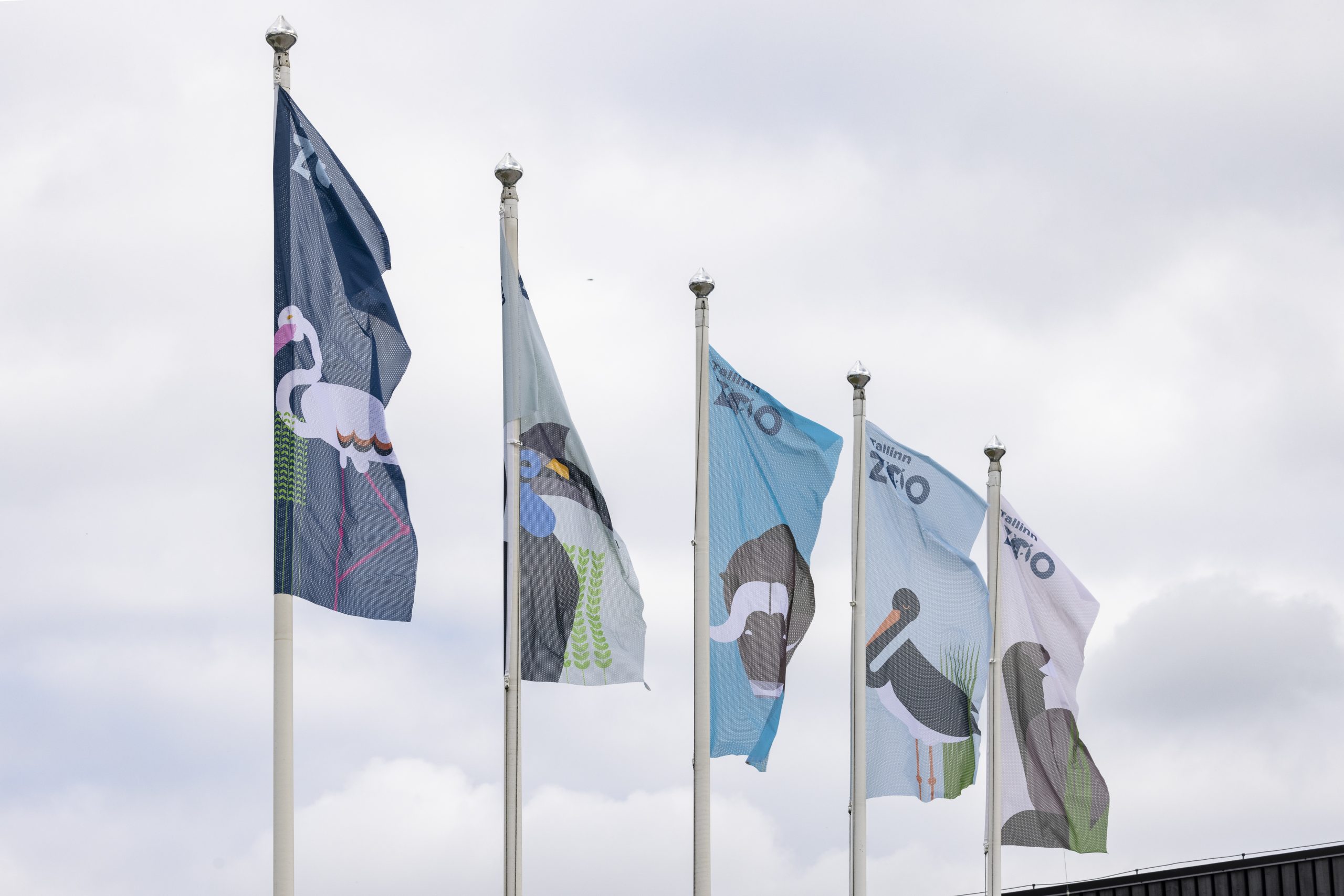
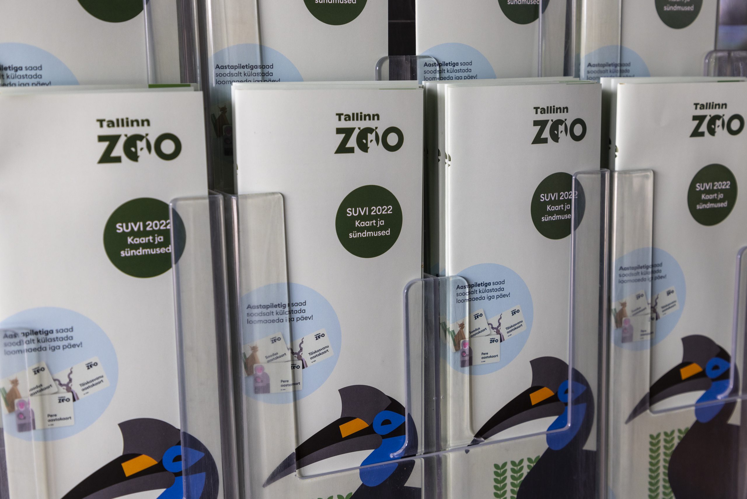
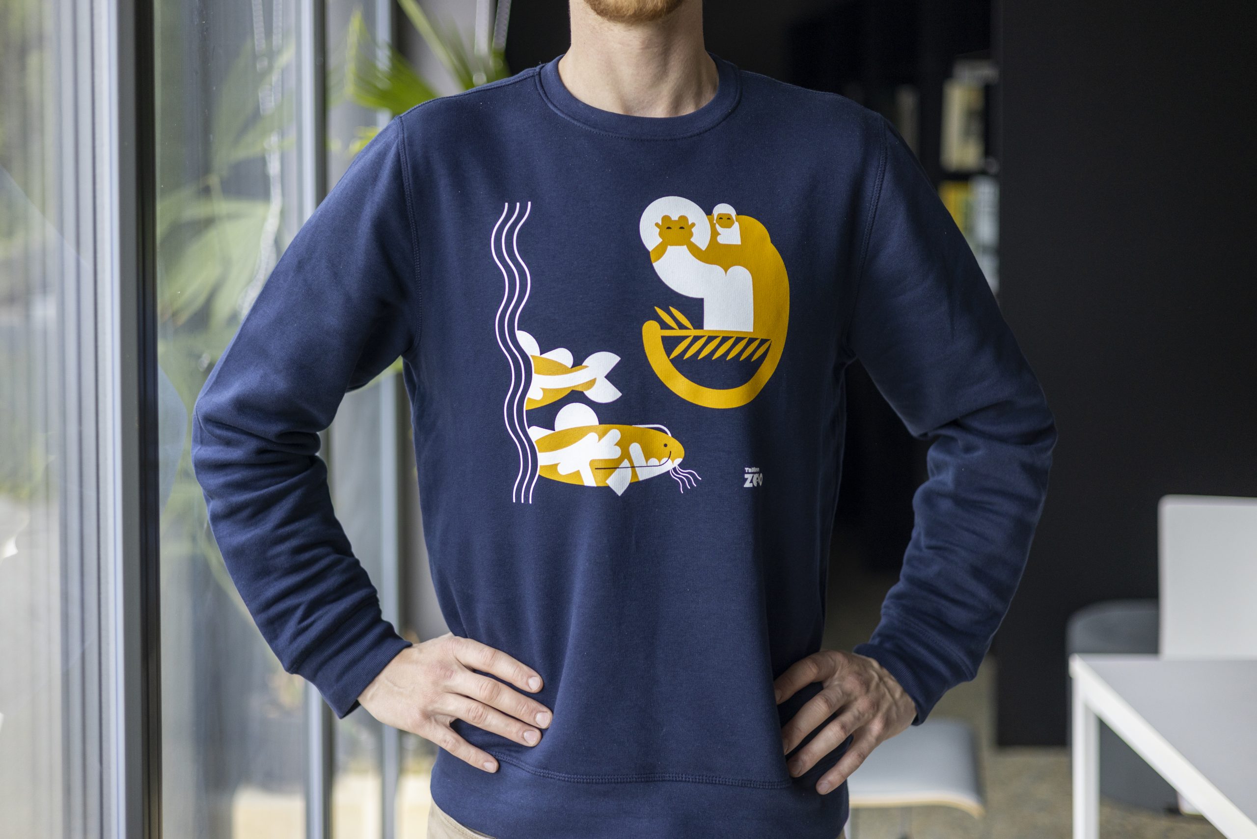
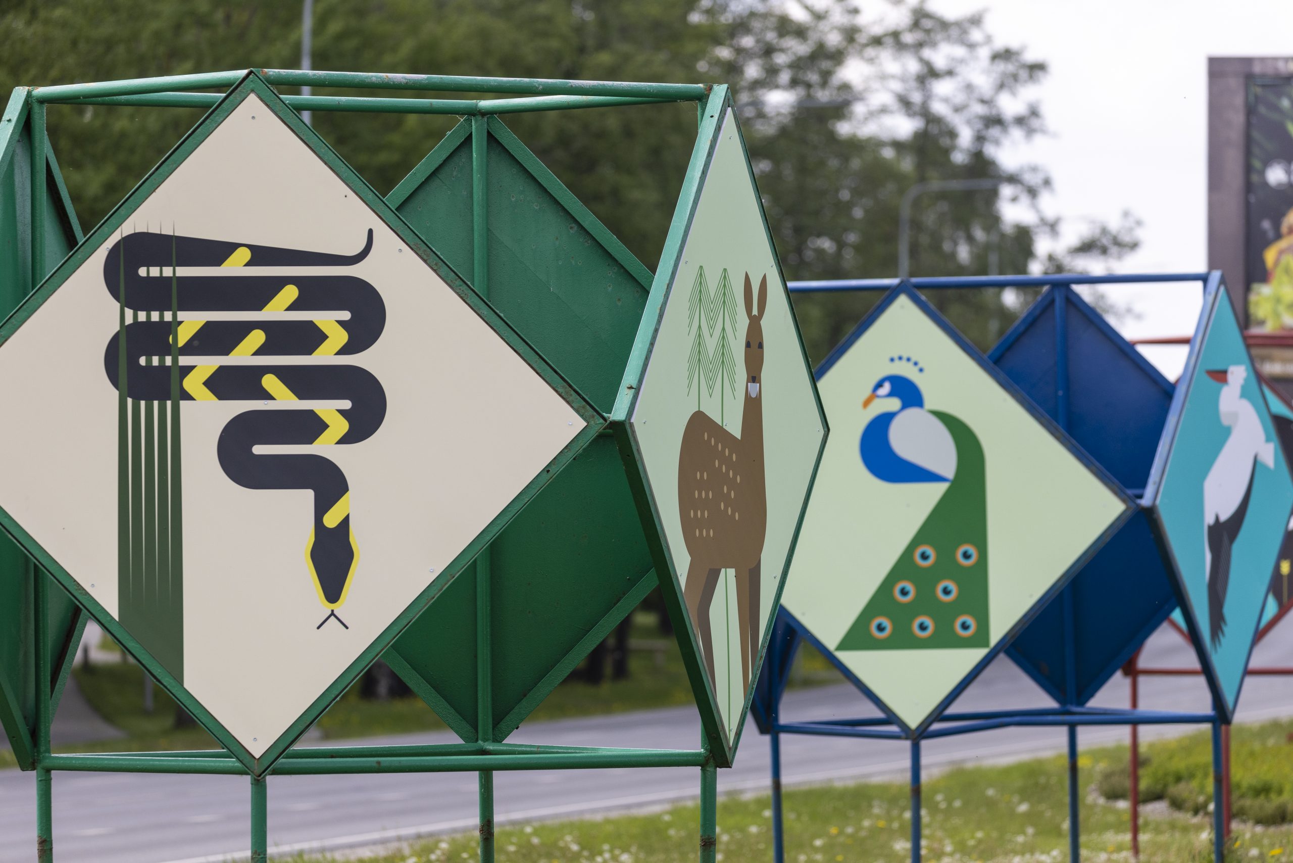
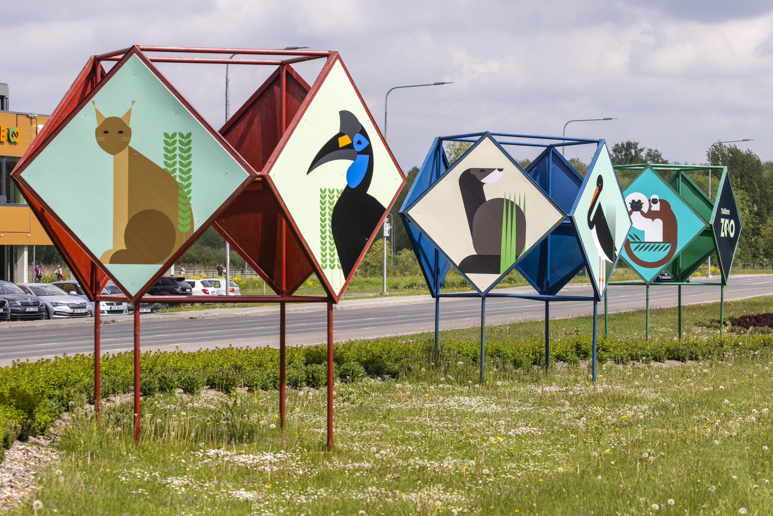
The CVI created by Polaar Studio is also the basis for the zoo’s new website, designed and created by the online agency Okia. With its attractive appearance, better navigation and logical user journey, it now allows us to tell you the whole story of our zoo. We hope that even just by browsing the home page, you will quickly find useful information for your visit: when the zoo is open, how to get there and buy a ticket, how to support the animals, and you will get an overview of what exciting things we have to offer you during your visit in the form of events, services and news.
We started the gradual transition to the new visual identity in the spring, and there is still more to come. In the meantime, make yourself comfortable in our new home, get to know the birth story of the zoo’s new logo and come visit us at the zoo. Here’s to exciting new summer encounters online and at the zoo!
The symbol of the zoo – lynx Illu 3.0
Historically, Tallinn Zoo has had two logos depicting the zoo’s very first resident – Illu the lynx. Both were authored by artist-animalist Sándor Stern (1924-2017). The new logo also continues the historical tradition, but with a new, exciting nuance.
Let’s allow Polaar Studio designers Kadri-Maria Mitt and Robi Jõeleht explain:
“Our first idea was to abandon the animal symbol in the logo and design it based on text, as both graphics and photos are already eloquent. However, while bouncing ideas with a large circle of decision-makers, there was still a wish that “someone” could be there.
As a variant, the European mink played an important role in (local) nature conservation, but we still found that the lynx is a strong regional symbol both as a species and as a specific individual, since the first inhabitant of Tallinn Zoo was the lynx Illu. The lynx was the best of the options considered, also because it is already recognizable enough as a portrait, without having to depict the animal from its nose to the tip of its tail (some people may also see a rooster in the logo, which can’t be resented or make the logo misleading in any way).

Stylistically, we initially experimented with simplifying the existing logo symbol, but the result did not honor the artist’s work so far – if not technically, then conceptually. Since the portrait of Illu in the old logo is also captured on the north gates of the zoo, it seemed like a sufficient tribute to the previous symbol, and we decided to abandon the “adapted” version and try something completely different.
We aimed for the new symbol to be as simplified as possible, acting more like a sign and less like an image of an animal. Since the visual impact of graphics and photos was still a factor, the best solution seemed to be to represent the symbol within the text, making it more compact and less dominant in the design materials. In addition to simply adding excitement to the solution, the light and shadow side of the portrait represent the daytime and/or nighttime lifestyles of the zoo’s inhabitants. The zoo also commented that the symbol also represents theatricality, which was a connection they welcomed. Overall, we found that considering the wide age group of the zoo, the representation of the animal in the logo is rather useful, as it is sufficiently eloquent even when used completely independently, and therefore offers a wide range of application possibilities.”


